• [2018/06/22]
    By using our forums, and our in-game services, you agree to be bound by our Privacy Policy found here:
    skullgirlsmobile.com/privacy

Forum Update - Feedback and Questions

WillTheDev

Hackerman
Moderator
Joined
Aug 10, 2020
Messages
15
Reaction score
14
Points
3
Hello forumites,

Sorry about the downtime. This forum update was a long time coming, and I hope the change isn't too jarring. We did what we could to keep things as similar as possible, however with a major upgrade like this, some things have to change. With that, however, comes a bunch of new features! Like a lot. A lot a lot. One being full Unicode support (please use emojis responsibly). Mobile has never looked better!

I welcome your feedback and suggestions. Happy posting!

~Will The Dev
 

Hall☆weenQueen

Well-Known Member
Joined
Nov 22, 2017
Messages
323
Reaction score
831
Points
93
Hello forumites,

Sorry about the downtime. This forum update was a long time coming, and I hope the change isn't too jarring. We did what we could to keep things as similar as possible, however with a major upgrade like this, some things have to change. With that, however, comes a bunch of new features! Like a lot. A lot a lot. One being full Unicode support (please use emojis responsibly). Mobile has never looked better!

I welcome your feedback and suggestions. Happy posting!

~Will The Dev
Hi Will,

Thanks for all the hard work you put into this format change-- it looks very sharp and classy (just like Skullgirls)!

My only concern is that status' are basically useless now since they're no longer displayed on the main page. They were a quick, easy way to get questions asked (like "who should I evolve?"), point out little things about the game and personal milestones, and made the forums less crowded in general.

Was there a reason they were moved out of view in the first place?
 
  • Like
Reactions: evilgordo

evilgordo

Well-Known Member
Joined
Jul 30, 2018
Messages
287
Reaction score
534
Points
93
Hi Will,

Thanks for all the hard work you put into this format change-- it looks very sharp and classy (just like Skullgirls)!

My only concern is that status' are basically useless now since they're no longer displayed on the main page. They were a quick, easy way to get questions asked (like "who should I evolve?"), point out little things about the game and personal milestones, and made the forums less crowded in general.

Was there a reason they were moved out of view in the first place?
Yeah, 'latest posts' and 'latest profile posts' (formerly status) are buried too deep depending on the layout. It’s an extra click or two, but you find them in 'What’s New' link in the menu.
 

WillTheDev

Hackerman
Moderator
Joined
Aug 10, 2020
Messages
15
Reaction score
14
Points
3
My only concern is that status' are basically useless now since they're no longer displayed on the main page. They were a quick, easy way to get questions asked (like "who should I evolve?"), point out little things about the game and personal milestones, and made the forums less crowded in general.

Was there a reason they were moved out of view in the first place?

The "Latest profile posts"? Those are still on the main page. I moved them up a bit just now so they're a bit more prominent. Lemme know if you're still having trouble?
 

evilgordo

Well-Known Member
Joined
Jul 30, 2018
Messages
287
Reaction score
534
Points
93
The "Latest profile posts"? Those are still on the main page. I moved them up a bit just now so they're a bit more prominent. Lemme know if you're still having trouble?
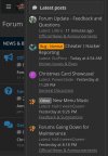
When the display resolution hits a certain size (phones, tablets in portrait mode), the side bar that contains 'Latest Posts' and 'Latest Profile Posts' disappears completely (only accessible with in What's New in the menu in the upper left):

sgm01.PNG
 

Lililira

Well-Known Member
Joined
Oct 24, 2019
Messages
310
Reaction score
686
Points
93
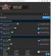
Could I request a slight change to the header spacing for computers / devices in landscape mode? The current header takes up the whole top half of the page on my 13 inch laptop because there's quite a bit of extra space above and below the banner image.

Another possible solution would be to condense the green profile bar into the right half of the Home bar the way that it is on mobile to save more space up top.


Full screenshot for reference:
Screen Shot 2021-01-16 at 9.10.28 AM.jpg


EDIT: Just realized that Tables have been added, and I want to say thank you so much for that! It'll make collecting / displaying data so much easier!
 
Last edited:
  • Like
Reactions: Art3mes

Hall☆weenQueen

Well-Known Member
Joined
Nov 22, 2017
Messages
323
Reaction score
831
Points
93
I'm still not seeing them on the main page? Here is what it looks like for me. I've got an android and I'm using Samsung Internet.20210116_093127.jpg20210116_093144.jpg
 
  • Like
Reactions: Art3mes

Art3mes

Well-Known Member
Joined
Mar 15, 2020
Messages
531
Reaction score
1,184
Points
93
please use emojis responsibly
😘

Everything is working like a charm especially the text editor and channel banner.
The profile posts' section should be placed somewhere else as its current position is undermining its value.
 
  • Like
Reactions: Hall☆weenQueen

WillTheDev

Hackerman
Moderator
Joined
Aug 10, 2020
Messages
15
Reaction score
14
Points
3
When the display resolution hits a certain size (phones, tablets in portrait mode), the side bar that contains 'Latest Posts' and 'Latest Profile Posts' disappears completely (only accessible with in What's New in the menu in the upper left):
Ah ok. That can be accessed with the kebab menu, the three vertical dots on the right next to the bell. That'll give you the side bar. I'm looking into making that more noticeable.
 

WillTheDev

Hackerman
Moderator
Joined
Aug 10, 2020
Messages
15
Reaction score
14
Points
3
Could I request a slight change to the header spacing for computers / devices in landscape mode? The current header takes up the whole top half of the page on my 13 inch laptop because there's quite a bit of extra space above and below the banner image.
I'll work on removing the excessive negative space.
 
  • Like
Reactions: Lililira

Renn

Member
Joined
Dec 28, 2017
Messages
60
Reaction score
25
Points
18
Age
22
Honestly, the update looks great. My only gripe is that I struggle to differentiate between posts I've read and unread posts, since the only difference is whether they're bold or not. If the blue on the main page when there's an unread subsection could also be used for the individual posts that would be very helpful.
 

Lililira

Well-Known Member
Joined
Oct 24, 2019
Messages
310
Reaction score
686
Points
93
Since profile posts and comments are limited to a certain number of characters, could I request a character tracker be added to the UI for making both of those? Thank you!

(I can't be concise to save my life, and I've already bumped up against it a couple times, and without knowing how close I am to the limit I find it hard to figure out what I need to trim to fit under the limit.)
 

WillTheDev

Hackerman
Moderator
Joined
Aug 10, 2020
Messages
15
Reaction score
14
Points
3
Honestly, the update looks great. My only gripe is that I struggle to differentiate between posts I've read and unread posts, since the only difference is whether they're bold or not. If the blue on the main page when there's an unread subsection could also be used for the individual posts that would be very helpful.
Unread posts should now be blue/
 

WillTheDev

Hackerman
Moderator
Joined
Aug 10, 2020
Messages
15
Reaction score
14
Points
3
Since profile posts and comments are limited to a certain number of characters, could I request a character tracker be added to the UI for making both of those? Thank you!

(I can't be concise to save my life, and I've already bumped up against it a couple times, and without knowing how close I am to the limit I find it hard to figure out what I need to trim to fit under the limit.)
This is oddly tricky to accomplish, but it's noted for the future.
 
  • Like
Reactions: Lililira